
Find a painting from an art reference
Pick the feature you want to carry into the room: a hazy skyline, a grid, the silhouette of a flower or a single colour across most of a canvas. These examples compare visible features in museum paintings and in works by Nikolay Cherednichenko. If you have a specific image, send it with the wall size and tell us what caught your eye.
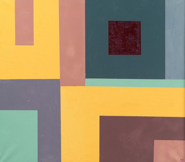
Broad areas of mustard yellow, dusty pink, mauve and muted green meet at right angles. A small burgundy square sits inside the dark teal area at the upper right.
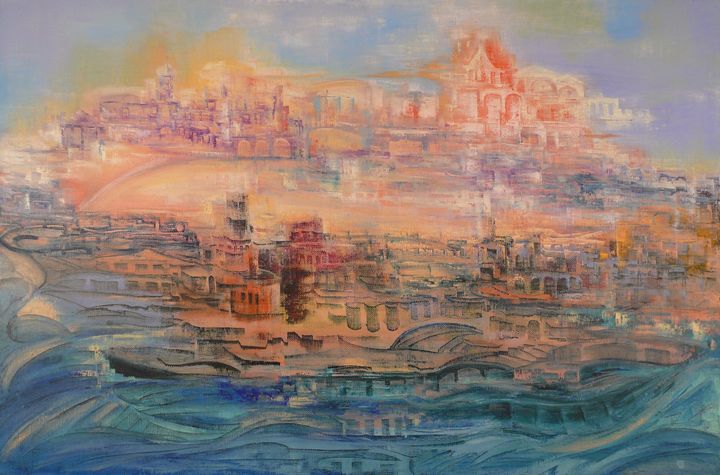
A pale city rises in tiers across the horizon, its domes and roofs picked out in peach and rose. Loose bands of blue-grey curve across the foreground.
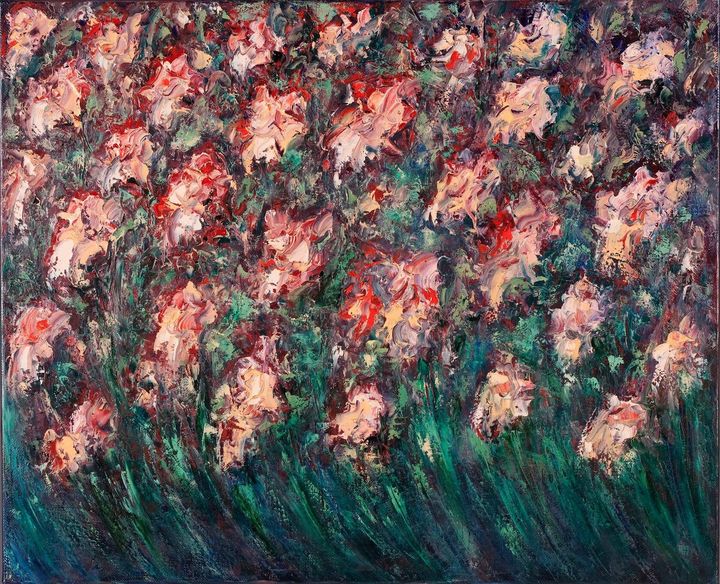
Pink and white flowers in close rows above deep green foliage.
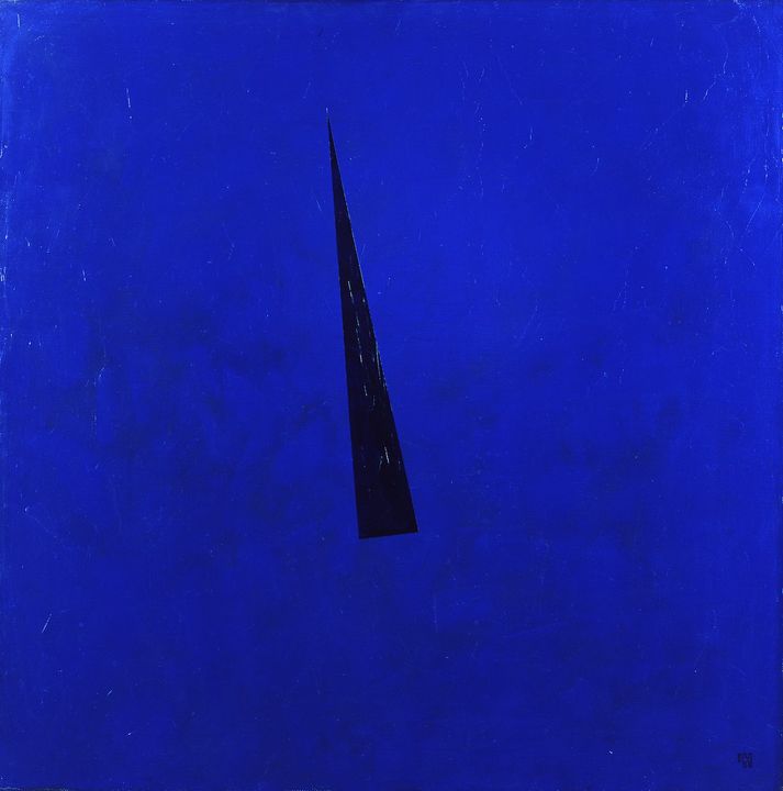
A thin dark wedge tapers across a mostly uninterrupted field of cobalt blue.
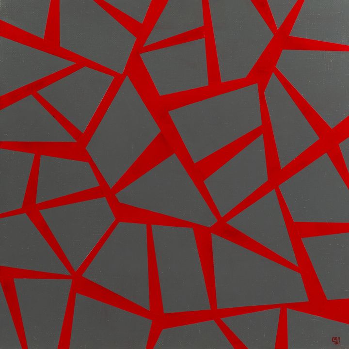
Red lines fork, turn sharply and meet again across a charcoal-grey square. Their changing widths divide the surface into irregular grey shapes.
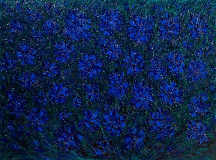
Clusters of deep blue and violet flowers almost fill the canvas. Dark green stems show through in the gaps, especially along the lower edge.
City and light
Mist softens the far shore in Monet’s The Thames below Westminster. In Turner’s Venice, the outlines of palaces merge with reflections in the lagoon. Compare the soft peach skyline in There Lived a Man in the Earth and the bands of sky and water in Once.
Angular buildings
Lyonel Feininger’s woodcut Gelmeroda turns a village church into a fan of intersecting lines. In The Master’s City A and B, overlapping blocks make the buildings almost continuous. The two canvases let you compare warm ochre and cool teal in the same format.
Geometry and line
In Richard Diebenkorn’s Ocean Park #125, narrow bands sit above a large pale field. Lacuna also uses large muted planes, with green, pink and ochre gathering around an irregular centre. For a composition with a more active line, compare the red branches in the angular-lines guide.
Flowers and brushwork
In Van Gogh’s Irises, winding contours distinguish individual stems and petals. In Cherednichenko’s Flowers, clusters of strokes take over. If you prefer the free rhythm of Joan Mitchell’s brushwork, compare Flowers with the more abstract Others and the blue and red strokes of Silky Way.
Colour fields and edges
Mark Rothko’s No. 10 places warm and cool fields against soft edges. For a gentle transition in an interior, start with the muted terracotta layers of De De. For a sharper line, compare the narrow wedge in Time and the pale verticals in Metanoia.
Ask about pricing and delivery
Send catalogue numbers, or tell us the size, colours and deadline for your project.